Poster Design
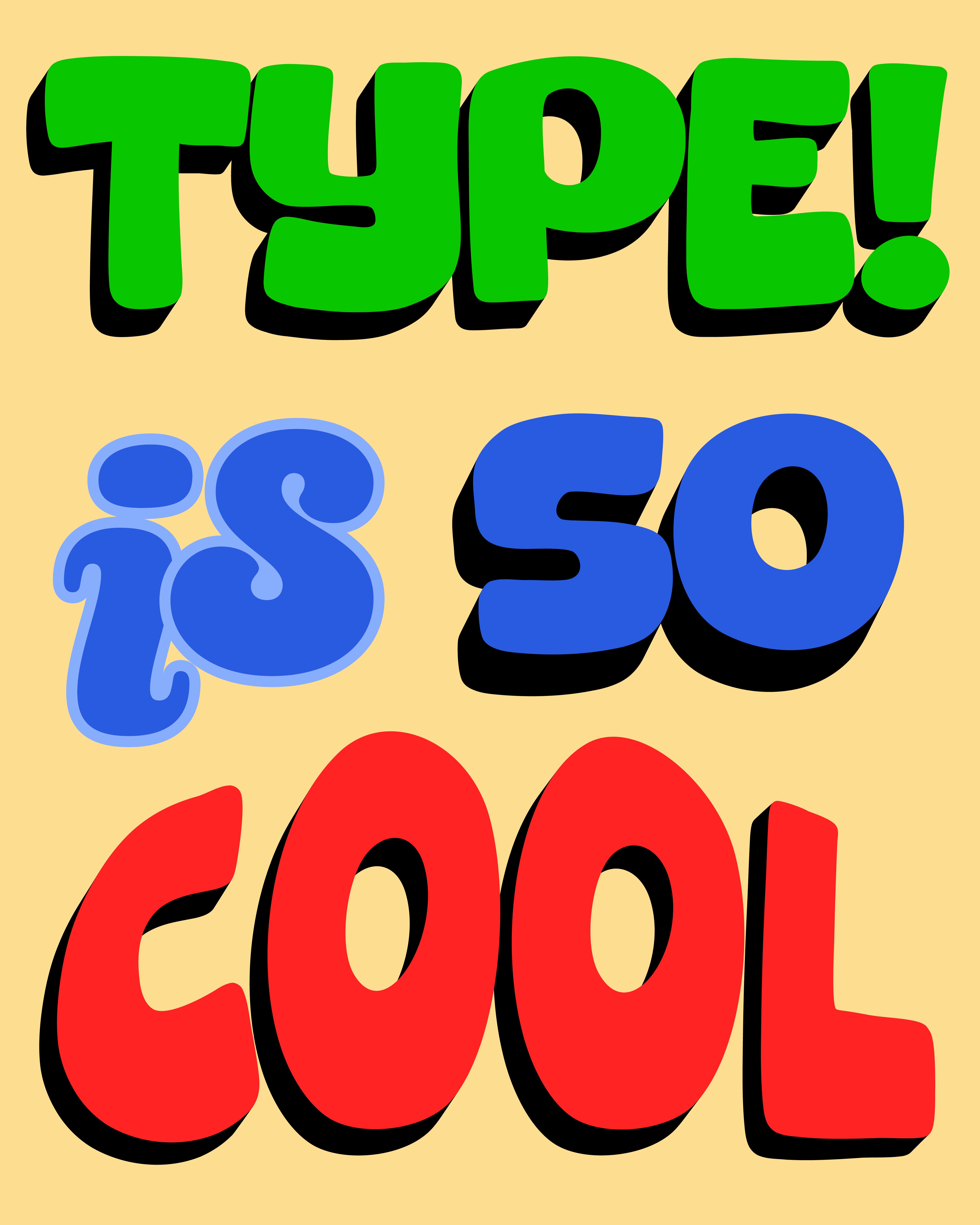
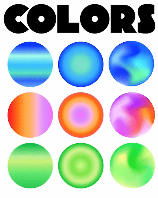
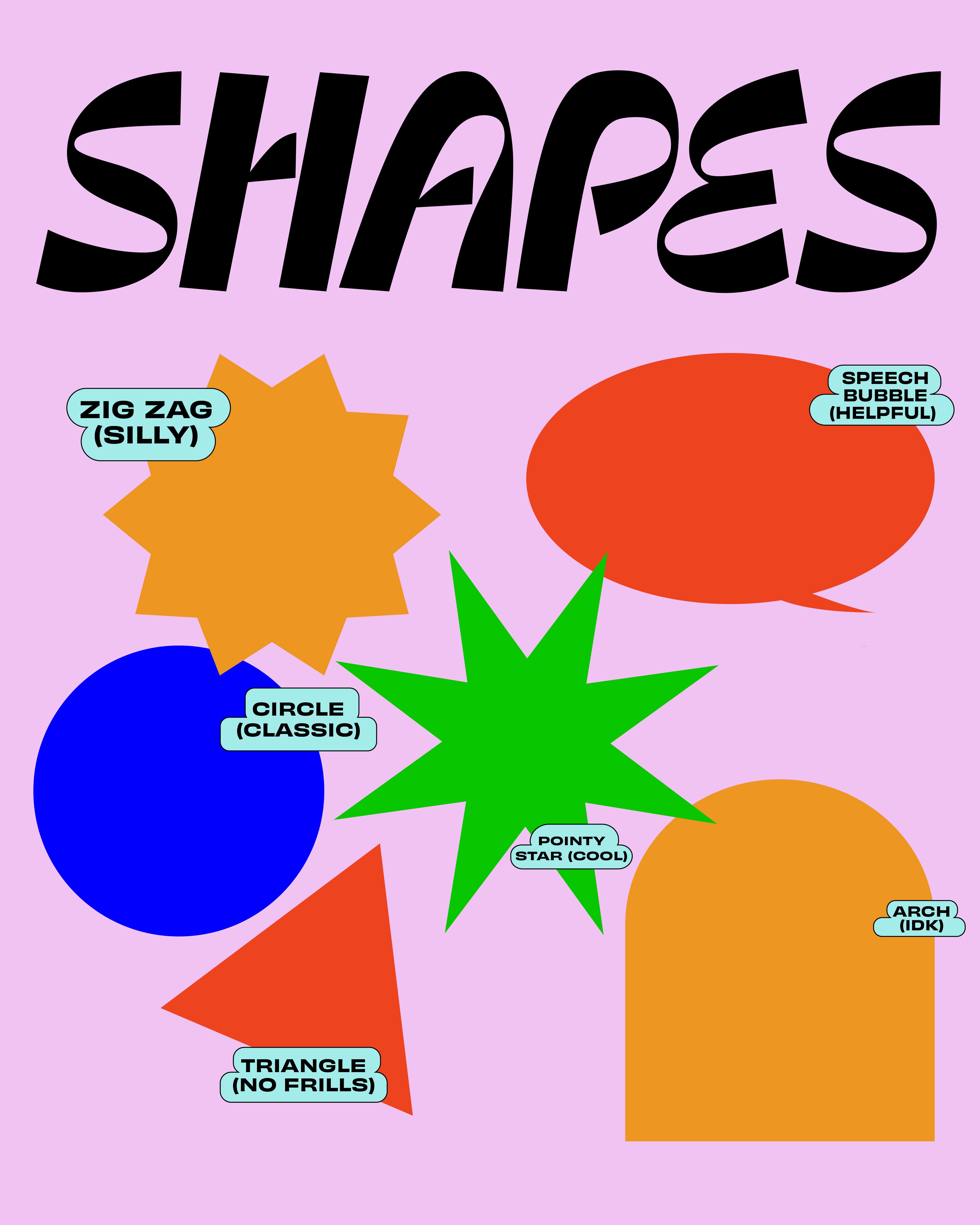
A fun, self-directed experiment exploring the building blocks of visual design shape and type through two playful poster studies. Rather than a client brief, this was a chance to loosen up and play with color, contrast, and personality in a low-stakes format.
Visual Design

Design Principles Applied
Bold color contrast, hierarchy through scale and weight, playful use of negative space, and consistent use of a limited, saturated palette to keep both posters cohesive as a pair.
Poster 2